


Why I like this art

Let’s talk about a couple paintings that I often look at with my students at the AGO. I like to bring them to this room because the art here really doesn’t fit into some people’s notion of what art looks like, namely that it look like “something”. Or, more specifically, that it is a depiction of something that I can recognize from the visible world. And, when people are faced with such images, their first go to is to try to recognize some shapes, to look for something that looks like a figure let’s say. What is your first impression when you look at these two pictures? Take a couple minutes to just look before reading further. Maybe write down some thoughts that come to mind.
In these kind of artworks, the title is often not very helpful. In this case, the second, Danger, gives us some help in the direction of a feeling.
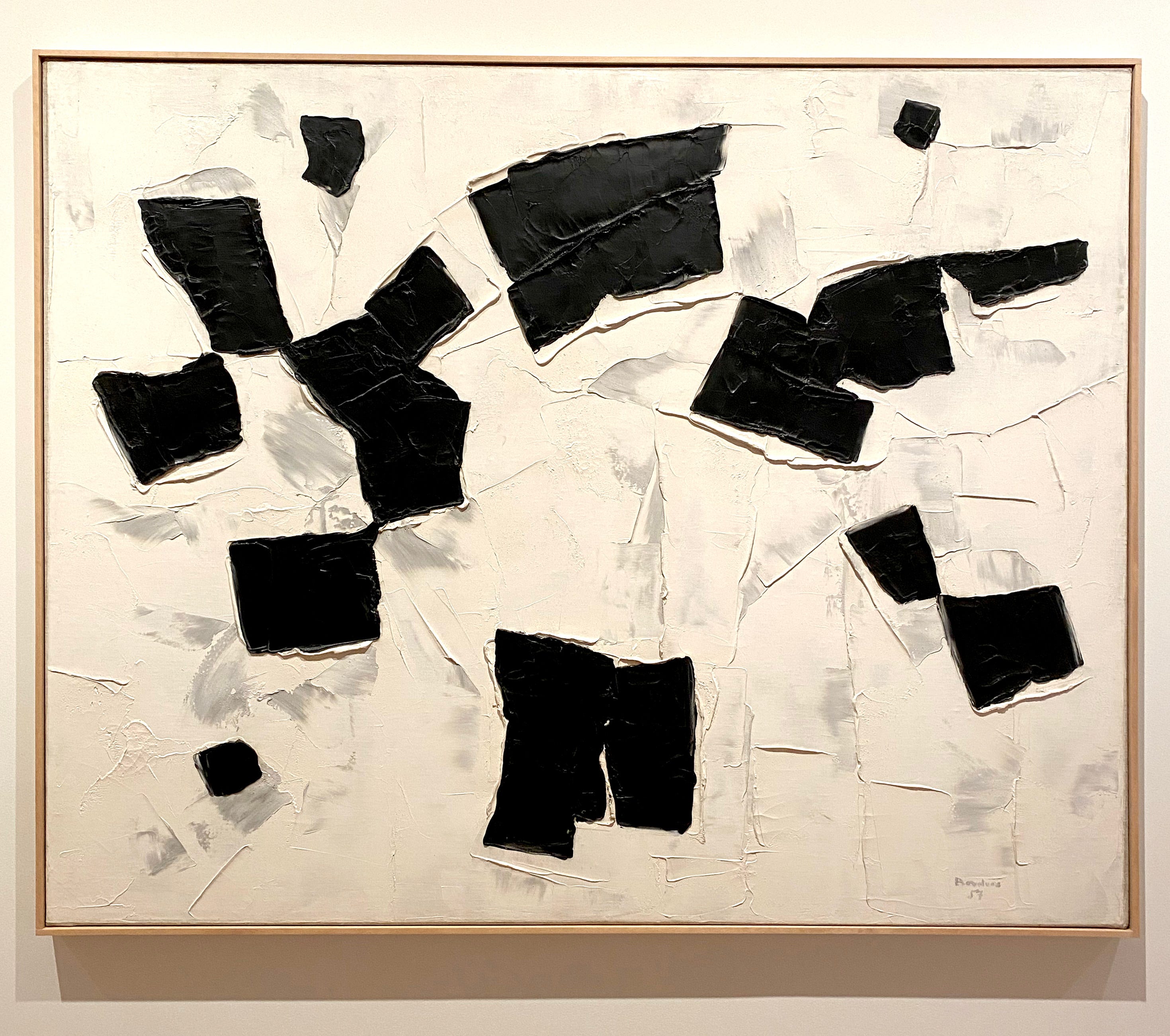
But before we seek somekind of meaning, let’s just figure out how these artworks were made. Both of these pictures are paintings in the sense that I really like: they have an assertive feel of the material. Although they do present images, they are primarily about PAINT, which is applied very thickly, in the case of the Borduas, with a trowel or palette knife. To do this, the paint has to be fairly dense, like butter or maybe cement for your tiles or plaster for the walls: it stays put once applied. This semblance to construction materials seems fitting for an artist who wanted to carve a new path for Quebec art and society.
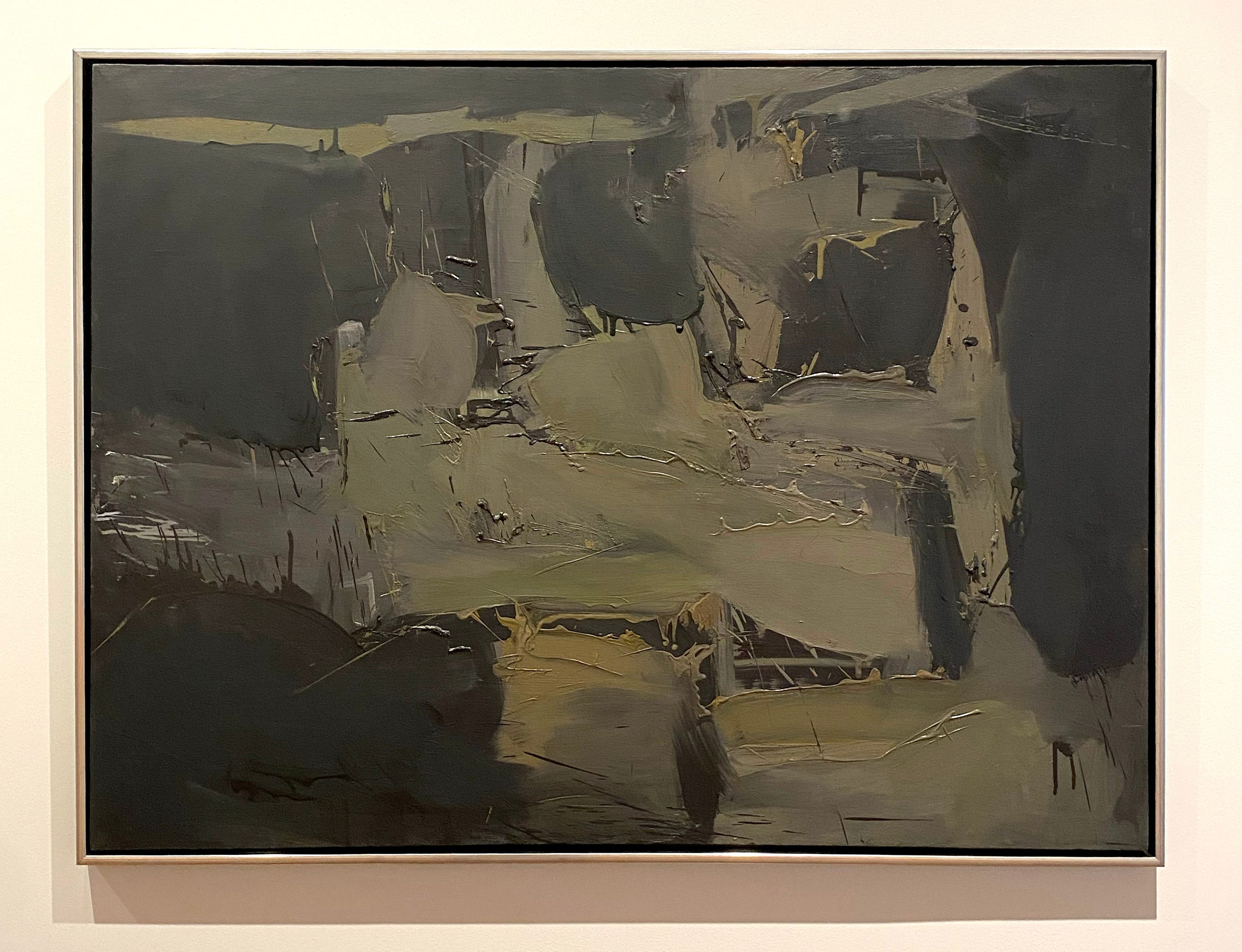
If you look at the Michael Snow painting from the same material point of view, you will see that the paint is equally assertive but with a different vibe. The paint was thick but more liquid, enough that it could drip a little. Drips are a thing that some artists get carried away with but I think it’s overdone and little more than permission to make slop. Here though, Snow allows his paint to drip only a certain amount. This means that he considered exactly how fluid his paint should be. Like ketchup or like honey, or like maple syrup? Somewhere in that range. Normally, drips all flow in the same direction but in this case, the artist turned his painting around as he worked and made his paint drip in different directions. Now they can become textures that are better incorporated in his image, rather than an element that stands out on its own. If you look closely, you can also perceive a kind of velocity of mark making: fast. The Borduas is slower in application. Can you see the difference?
Now, let’s look at the image content here but without trying to make the shapes into some thing recognizable. Instead, let your eyes glide on the surface and notice if your vision slows down at any point. Is there anything that causes you to want to look closer? Is there anything that appears which you did not see in the beginning?
In the Borduas painting, we see very stark black and white shapes. Are the black shapes holes in a white surface or are they objects on a white background? The thickly applied paint generates shadows. How do you interpret the painted gray shapes in relation to these real shadows? In other words, shadows are tied to the objects that cast them - are the gray elements tied to some depiction of the black shapes as objects or not?
In the Snow painting, between the black shapes and the gray shapes, which are objects and which are spaces? Do you get a sense of foreground, middle ground and background? Do the drip marks create a sense of hatching, especially when they overlap? Do they give you a sense of some kind of texture or an impression of movement?
There is no “correct” answer to the questions I proposed to you. But asking questions such as these gets us looking more closely and paying attention to our own perceptions. Art is supposed to push you beyond the realm of your everyday experiences and abstract painting does this best. What are your thoughts on this?
I wrote a fuller article on the issues of looking at abstract art in this post:
What do you want from art?

I took my third year painting class to the AGO to look at and analyze some art. We ended up in this room. I asked them what they thought of the orange painting. “It makes me angry” “It makes you angry?! WHY?” “ I donno, it’s just a bunch of orange, the lines aren’t even straight, it bugs me..” It’s too simple, anyone could have done it, etc. It’s always…
Love this breakdown of the visual experience. It is a relearning of seeing, with ALL of our senses. In Monet's words, “To see we must forget the name of the thing we are looking at.”
Agreed. It’s blasphemy to try to recognize everyday objects in abstract paintings.
Emotions are thoughts accompanied by somatic effects, like tingling or heaviness in throat and chest or goosebumps, and shivers sometimes overwhelming to cause full body shaking. With language, such thoughts can be described with words like warmth or comfort or uneasiness or bliss… and with visuals, such thoughts can be expressed with abstract painting. I love these two.